Feb 24, 2014

Favorite Photo Editing apps for your phone

(texto en español al final de la entrada)

Hello there! 

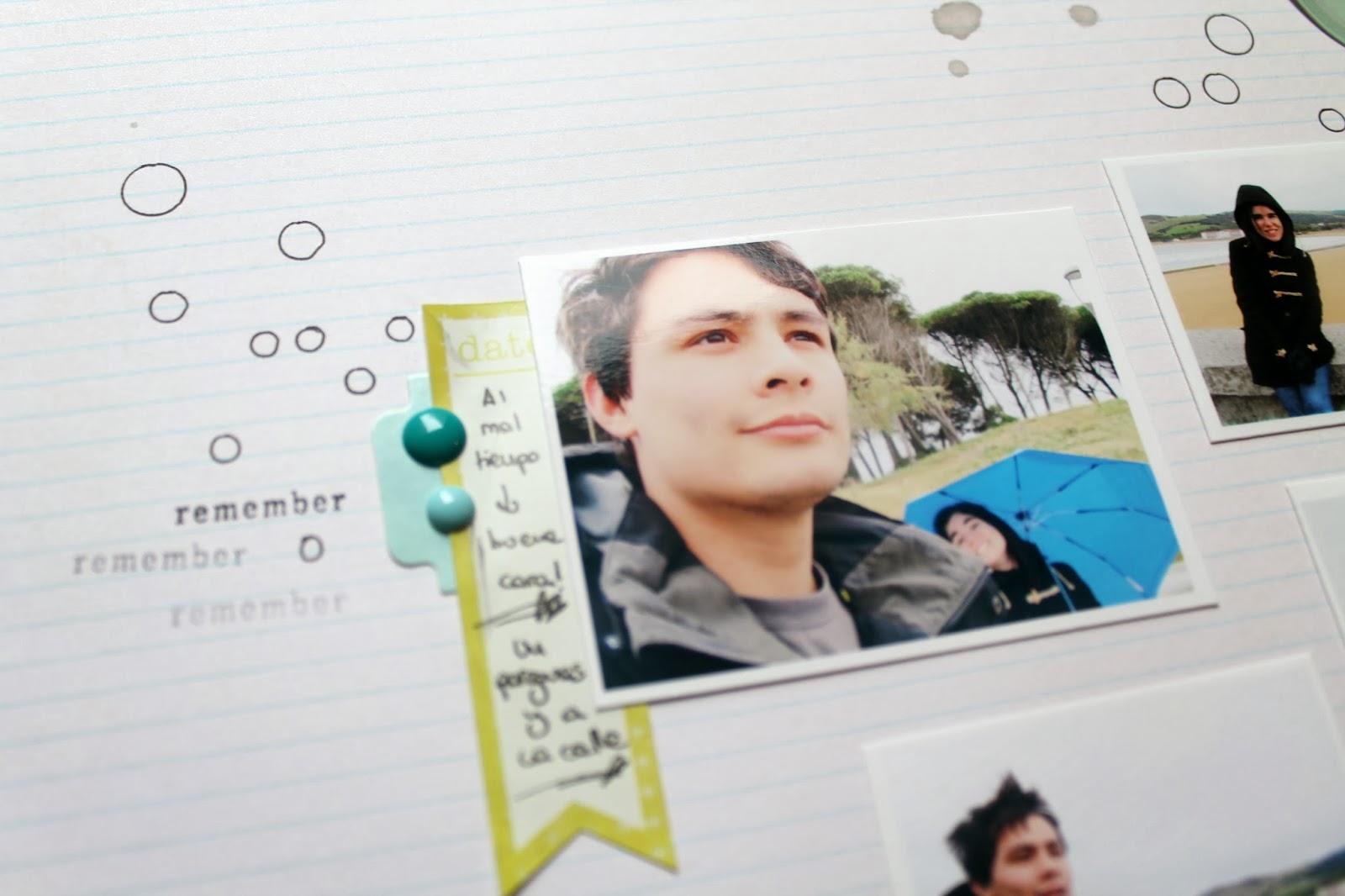
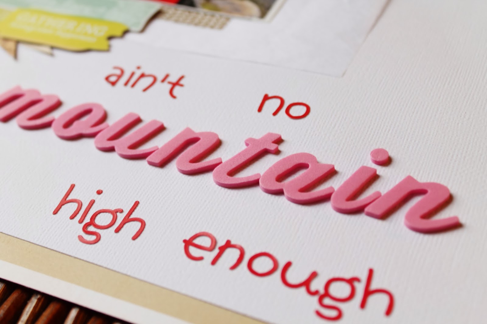
Today I just wanted to share some of my most favorite photo editing apps that you can use on your smart phones, ipads etc. I mostly use them to post photos on my Instagram, on my blog or for my Scrapbooking pages. They are very user friendly and cheap as well. To show you what can you obtain with those apps, I will show you how I turned a simply photography into a cute photo for your social media or your Scrapbooking/Project Life spreads.

So, this is the original photo I took with my Iphone 4S. And you will see how through some of my favorite apps I personalize it.


PicTapGo ($0.99): this is an app from Totally Rad Actions. This last year they developed a photo editing system in app form which is totally awesome! It helps you to express your creative style. You can stack filters, resize you photo, save custom effects and more. My favorite filters are Lights On, Sugar Rush, Air, Crispity, Cool It down, Fade to Autumn and any B&W filter.


PicFrame ($0.99): A photo collage app can be a great addition to your device. Collage apps give you the power to assemble multiple images from one event or day into a single snapshot that captures the overall vibe.  Select one of the 20+ frames, add your pictures (from 2 to 8 or even more) and that's it! There are also several free apps to collage photos.


ABeautifulMess ($0.99): The filter tool allows for easy adjustment of color and brightness. The other tools available are borders, text, phrases and doodles. I loooove this app. My only problem is that sometimes I have a hard time getting the font as small as I want it hehe I love that there are a huge variety of colors in the new version and so many awesome improvements in terms of features, as photo collages or a higher resolutions of the photos. There many many similar apps out there too. In fact, I have heard a lot of good recommendations about the Rhonna Designs app and I can't wait to play with it. There is also Phoster, Over and many more :)


Afterlight ($0,99): I starting using this app because I like their circular frame hehe. But they have other cool options as well as other frames with different shapes or even alphabet shaped frames. There is also a huge variaty of filters  and you can play with the set-up of the photo too!


Have fun editing your favorite photos!

xoxo

Boo

/////////////////////////////////////


¡Hola!

Hoy sólo quería compartir algunas de mis aplicaciones favoritas para editar fotos que puede utilizar en sus teléfonos inteligentes, iPads, etc  En su mayoría los utilizo para publicar fotos en mi Instagram, en mi blog o en mis páginas de Scrapbooking. Son muy fáciles de usar y baratas. Para mostrar lo que se puede obtener con esas aplicaciones, hoy mostraré cómo convertí una simple fotografía en una foto mona para las redes sociales o para Scrapbooking o albumes de Project Life.

Esta es la foto original que tomé con mi iPhone 4S. Y veréis como a través de algunas de mis aplicaciones favoritas la personalizo.

PicTapGo ($ 0,99): esta es una aplicación del grupo Totally Rad Actions. Este último año desarrollaron un sistema de edición de fotos en forma de aplicación totalmente impresionante! Se le ayuda a expresar su estilo creativo. Puedes apilar filtros sobre una misma foto, cambiar el tamaño de la foto, guardar efectos personalizados y más. Mis favoritos son los filtros Lights On, Sugar Rush, Air, Crispity, Cool It down, Fade to Autumn y cualquier filtro B&W.


PicFrame ($ 0,99): Una aplicación de collage de fotos puede ser una gran adición. Aplicaciones Collage te dan el poder para ensamblar múltiples imágenes de un acontecimiento o un día especial en una sola instantánea que captura el ambiente en general. Puedes seleccionar entre más de 20 marcos distintos en lo que añadir tus fotos (de 2 a 8 fotos o incluso más). También hay varias aplicaciones gratuitas para fotos collage.

ABeautifulMess ($ 0,99): La herramienta de filtro permite un fácil ajuste de color y el brillo. Las otras herramientas disponibles son bordes, textos, frases hechas y garabatos. Me encanta esta aplicación . Mi único problema es que a veces tengo dificultades para conseguir el tipo de letra tan pequeño como lo quiero jeje También me gusta la gran variedad de colores en la nueva versión y tantas mejoras impresionantes en términos de características, como la posibilidad de crear collages de fotos o un una mayor resolución de las fotografías. Existen muchas aplicaciones similares por ahí también.  De hecho, he oído un montón de buenas recomendaciones sobre la aplicación de Rhonna Designs y tengo muchas ganas de probarla! También están Phoster, Over y muchas más :)

Afterlight ($0,99): En realidad empece a usar esta aplicación porque me gustaba su marco circular hehe. Pero tienen otras opciones interesantes también como marcos con otras formas o en forma de letras. También tienen muchos filtros donde elegir y puedea jugar con las características de la foto también.

¡Qué te diviertas editando tus fotos favoritas!

xoxo

Boo

Feb 18, 2014

Be my Valentine!!

(texto en español al final de la entrada)


Oh Happy Love Day!!!

I know I know... Valentine's Day was the last Friday but as I din't have the chance to celebrate it on that day I didn't have the rush neither to prepare everything for the 14th. But finally  I completed it and I'm so happy with the little package I created and all I want to do now is give it to my boy. In fact. I hope he is not reading this because I have to wait a few more days to celebrate this special day hehe So, what's inside the bag?


All these goodies!! I got inspired by the Lindsay Letters "I'll eat you up I love you so"card. I chose a lot gold embellishments, red, white and pink... and lots of sweets of course!  I also had fun adding confetti because it is a day to celebrate, right?  A handmade envelope and card, some cute "Wild Thing, You make my heart sing" tags attached to a Pascal figure from the movie Tangled (Disney), heart shaped sweets, chocolates and a couple of cupcakes. As I said before I love pom-poms so I attached a couple of them to a pair of spoons. How cute are those? To decorate the outside of the bag I mainly used Studio Calico and Dear Lizzy products. Cute pie!


Now, I leave you with more in detail photos! I hope you had fun on the 14th with the people you love the most!

xoxo

Boo


////////////////////////////////////

¡Oh, Feliz Dia del Amor !!

Ya sé, ya sé... el Día de San Valentín fue el viernes pasado, pero como tuve la oportunidad de celebrarlo ese día, tampoco tenía prisa para preparar todo para el día 14. Pero al fin lo he terminado y estoy super contenta con el pequeño paquete que he creado y todo lo que quiero hacer ahora es darselo a mi chico. De hecho espero que no esté leyendo esto porque aun toca esperar unos días más para celebrar este día tan especial jeje Pero entonces, ¿qué hay dentro de la bolsa?

¡Todas estas golosinas! Me inspiré en la tarjeta de Lindsay Letters que quiere decir "Te voy a comer Te quiero tanto ". Elegí muchos adornos dorados, rojos, blancos y rosas... y ¡un montón de dulces por supuesto! También me he divertido añadiendo un montón de confeti porque es un día para celebrar, ¿no? Un sobre hecho a mano y la tarjeta, algunas tarjetas atadas a una figura de Pascal de la película Enredados (Disney), dulces en forma de corazón, chocolates y un par de magdalenas. Como ya he dicho anteriormente me encantan los pompones y me animé a atar un par de ellos a unas cucharas. ¿A que quedan monas? Para decorar el exterior de la bolsa usé principalmente adornos de Studio Calico y Dear Lizzy!

Ahora, os dejo con más fotos en detalle. ¡Espero que os hayáis divertido el dia 14 con la gente que más queréis!

xoxo

Boo

Feb 17, 2014

Rainy Days (a 10 minutes page)

(texto en español al final de la entrada)

Hi!

Ok. Which has been the shortest time that you needed to complete a single layout? For me it was 10 minutes. I know that is almost nothing! But that it is exactly the time that took me to do this simple layout. I wanted to include 4 photos o a single layout but I didn't wanted the page to become over decorated and full of things so I went with a very simple and soft design.


First, I took a very soft paper background and I doodled some circles helping me with a stencil. Then I placed the photos on an interesting arrangement. The photos were taken on a really grey day so I wanted the page to have the same kind of felling. I added some grey splatters next to the circles so it kind of remind to the rain drops.


 I also added some lemon embellishments and turquoise with the same purpose: water.


The paper stripes are the ones to cut from the bottom part of the 12x12 papers where the name of the collection and all that information appears. I normally throw them to the paper trash but sometimes, if they have a really good design, I keep them to use them on a page.


Then, I just added my journaling and some stamping and the page is done. In only 10 minutes! Which is your record? I wanna hear it!

xoxo

Boo

///////////////////////////////////////////

Hola,

Vale. ¿Cuál ha sido el menor tiempo que habeis necesitado para completar una única página? Para mí, 10 minutos y eso es ¡casi nada! Pero ese es exactamente el tiempo que me llevó realizar esta página de diseño tan sencillo. Quería incluir 4 fotos en una misma página pero sin que se convirtiera en algo muy recargado y demasiado decorado, así que me decidí por un diseño muy simple y suave.

En primer lugar, escogí un papel de fondo muy suave y dibujé algunos círculos ayudándome con una plantilla. Después, coloqué las fotos en una disposición interesante. Las fotos fueron tomadas en un día muy gris, así que quería que la página tuviera el mismo estilo. He añadido algunas salpicaduras de color gris junto a los círculos para simular unas gotas de lluvia.
También he añadido algunos adornos de color limón y turquesa con el mismo objetivo: el agua.
Las tiras de papel son los que se cortan de la parte inferior de los papeles 12x12 donde suele venir el nombre de la colección y toda esa información. Normalmente suelo tirarlas a la papelera, pero a veces, si tienen un buen diseño las mantengo para usarlas ​​en alguna página .
Ya solo queda agregar el diario y los sellos y la página está hecha. ¡En 10 minutos! ¿Cuál es tu record? ¡Quiero escucharlo!

xoxo

Boo


Feb 15, 2014

Travel Girls (Biscuit Project DT)

(texto en española al final de la entrada)

Hi there!

Today I am bringing you another fun project made with the February Scrap Non-Stop kit from Biscuit Project. February has been a crazy month, full of work so I din't have enough time to work with this kit as much as I wanted. But in the end I managed to find some spare time to make this super quick and easy card.


I mainly used the Wanderlust collection from Studio Calico. Aren't those stitched frames the cutest frames ever? I placed the frame on top of a cute paper from the same collection and I added a little badge which was not included in the kit but it coordinated so well with the colors of the card that I couldn't resist using it!


Those ink splashes were made with the Mr. Huey included in the Biscuit Project January kit as the Neon Pink Dauber didn't work well with this card.


In the end I am thinking of using it as a mini album cover.  It would work really well with some old photos of my friends and I traveling the world. What do you think?

xoxo

Boo


//////////////////////////

¡Hola! 

Hoy os traigo otro proyecto divertido hecho con el kit de febrero de Biscuit Project. Este mes ha sido un mes de locura y de trabajo por lo que no he tenido tiempo suficiente para trabajar con este kit tanto como yo hubiera querido. Pero al final me las arreglé para encontrar un poco de tiempo libre para hacer esta tarjeta muy rápida y fácil. 

He utilizado principalmente la colección de Wanderlust de Studio Calico. ¿No son esos marcos con elementos cosidos los marcos más monos del mundo? Coloqué el marco sobre un papel de la misma colección y añadí una pequeña chapa que no estaba incluido en el kit pero que coordinaba tan bien con los colores de la tarjeta que ¡no me pude resistir!
Hice esas salpicaduras de tinta con el Sr. Huey incluido en el kit de enero de Biscuit Projecto ya que el Dauber rosa Neon no funcionaba bien con este proyecto. 

Al final estoy pensando en usarlo como portada de un mini álbum, ya que creo que funcionaría muy bien con algunas fotos viejas  de mis amigos y yo viajando por el mundo. ¿Qué os parece? 

xoxo

Boo

Feb 14, 2014

Waking up (Biscuit Project DT)

(texto en español al final de la entrada)

Hello!

This is my second month as a Biscuit Project Design Team member and I couldn't be more excited.  I have so many cool ideas to share with this team and with you... I can't wait to post them! But for now let's have a look into this month's sketch and kit. To make this page I followed this month's sketch by Biscuit Project (see the full post in their website here). And to create it I used the Biscuit Project February Scrap Non-stop kit (find it here). Here you have a peek on their awesome kit and you can find the sketch down as well.


This is my layout:


I love the bright colors of this kit which is mainly composed by the newest collection of eScrap and Wanderlust collection by Studio Calico. I decided to go with a super girlie combo (again) using the pinks, greens and B&W of the kit. I started by combining some of the greens and pink papers which go well with my niece's pullover. Great! :)


Then, I painted some circles with the super cool Neon Pink Dauber. I love how it coordinates perfectly with the background paper as it has pink dots as well. I decided to doodle some circles with a black pen too.  I love how some hand-drawing or writing gives the page a more personalized look. hehe And it coordinates as well with the alphabet included in the kit. Have you seen the Alphabet thickers? They are awesome and they have become one of my all time favorite alphabet, seriously.


As I said before, the kit is partly composed by the newest collection of eScrap (Sinergias). This is my first time working with their products and I couldn't be more happy with the result! However, as I normally work with embellishments in English,  I decided to cover some of the Spanish phrases with some Studio Calico stickers.What a pity!! They are so lovely! But I am planning of using them in some Valentine's cards! Yaaaaay


To finish the page, I added a tag, some handwriting, gems and a few stamps here and there (these stamps are from Studio Calico and they are not included in the kit).

Now it is your time to play with the February sketch! Don't forget to share your approach on the Biscuit Project website. One lucky winner will be chosen and he/she will receive the March Kit. Good luck!

xoxo

Boo


//////////////////////////

¡Hola!

Este es mi segundo mes como miembro del Equipo de Diseño Biscuit Project y no podría estar más emocionada. Tengo muchas ideas interesantes para compartir con este equipo y con vosotros y...  ¡no puedo esperar para publicarlos! Pero por ahora vamos a echar un vistazo al boceto de este mes y el kit. Para realizar esta página seguí el boceto de este mes de Biscuit Project (podéis ver el post completo en su página web aquí ). Y para crearlo he usado el kit de Biscuit Project de febrero Scrap Non-Stop ( podéis encontrarlo aquí ). A continuación podéis echar un vistazo a su impresionante kit y el boceto también.

Me encantan los colores vivos presentes en este kit, el cual está compuesto principalmente por la nueva colección de Escrap y la colección Wanderlust de Studio Calico. Me decidí a seguir  un combo súper girlie (de nuevo) con los tonos rosas, verdes y B&W del kit. Empecé por la combinación de algunos de los papeles de color rosa que iban bien con el jersey de mi sobrina. ¡Genial! :) 
Después, dibuje algunos círculos con la tinta super guay Neon Pink Dauber. Me encanta cómo se coordina perfectamente con el papel del fondo, ya que este tiene círculos de color rosa también. Me decidí a garabatear algunos círculos con un lápiz negro también. Me encanta como algo dibujado o escrito a mano le da la página un aspecto más personalizado. jeje Y coordina además con el alfabeto incluido en el kit. ¿Has visto el alfabeto? Es increíbles y se han convertido en uno de mis favoritos, en serio.
Como he dicho antes, el kit se compone en parte por la nueva colección de Escrap (Sinergias). Esta es mi primera vez trabajando con sus productos y no podría estar más feliz con el resultado. Sin embargo, ya que normalmente trabajo con adornos en inglés, me decidí a cubrir algunas de las frases en español con algúna pegatina de Studio Calico stick. ¡Una lástima! Son tan monas... ¡Pero tengo la intención de utilizarlas en algunas  tarjetas de San Valentín! Siiiii
Para terminar la página,  he añadido una etiqueta, un poco de escritura, gemas y algunos sellos aquí y allí (estos sellos son de Studio Calico y  no están incluidos en el kit) .

¡Ahora es tu turno para jugar con el boceto de Febrero! No te olvides de compartir tu proyecto en la página web de Biscuit Project . Un/a afortunado/a ganador será elegido/a y  recibirá el kit de marzo. ¡Buena suerte!

xoxo

Boo

Feb 13, 2014

Winter. Currently


planning my next trip to visit my boyfriend, this time to Mexico
going to see The Lion King Musical with my family on March
becoming addicted to Studio Calico kits...yikes...poor wallet
watching Cupcake Wars with my mom... because we love to eat cupcakes
reading Game of Thrones book 5 (still) as it seems an endless book
celebrating life and happiness in every detail of my everyday life
loving hand-made and personlized gifts every day more
eating rice with sausages and chicken whenever I feel exhausted
enjoying the moments with my niece as she is getting more interesting every day
wearing Free People clothing whenever I can ... and boots
collecting Disney DVD Movies as I had to throw away the old tape ones
working on the same projects at the lab over and over again
walking or rather running to the bus every single day at the same time through the same streets
trying to not thinking about the summer yet
feeling excited for this new year full of amazing plans
wishing I could spend more time being creative than worrying for my work

xoxo
Boo

//////////////////////////////////////////////

planeando mi próximo viaje de visita a mi novio, esta vez a México
yendo a ver el musical de El Rey León con mi familia en marzo
convirtiendome en adicta a los kits de Studio Calico ... uff ... pobre billetera
viendo Cupcake Wars con mi amá... porque nos encanta comer cupcakes
leyendo Game of Thrones libro 5 ( todavía ) ya que parece un libro interminable
celebrando la vida y la felicidad en cada detalle de mi vida cotidiana
amando los regalos hechos a mano y personlaizados cada día más
comiendo arroz con salchichas y pollo cada vez que me siento agotada
disfrutando de los pequeños momentos con mi sobrina ya que cada día está más interesante
vistiendo ropa de Free People siempre que puedo... y  botas
coleccionando DVD de pelis Disney ya que tuve que tirar las viejos videos
trabajando en los mismos proyectos en el laboratorio una y otra vez
caminando o más bien corriendo al bus todos los días a la misma hora por las mimas calles 
tratando de no pensar en el verano todavía
sintiendome emocionada por este nuevo año lleno de proyectos asombrosos
deseando poder pasar más tiempo siendo creativa en vez de estar todo el día preocupada por mi trabajo

xoxo
Boo

Feb 10, 2014

Everyday

Hello there,

I love finding new sketches in the SC gallery, among projects from other members! I know there are several pages where they share new sketches every week but sometimes for me it is easier and faster to find new sketches in the SC gallery. I love Anna-Maria Wolniak pages (find her blog here), they are always so innovative and colorful with all that watercoloring. But I also find interesting her sketches. They are really dynamic and fun. So today's page was based on a previous project from her. I do not normally used the same kind of elements or colors from the project that I got the sketch but this one was pretty magical so I decided to used the same colors as well!


I never thought of a beige and blue color combo and I was surprised of how well it turned out! Don't you think? So again, once I had the sketch and the colors I just looked on my stash for different elements and papers of the same colors to create my page. I also added some gold to make the page more shiny hehe


I love this badge with the handwritten phrase! It is super cool and eye-catching, same as that camera paper clip. The cutest clip E.V.E.R. ;) I adore to mix and match different collections as I normally do because that is the fun part: finding things that coordinate or that complement very well the photo, which for me it always has to be the main element of the page.


I love adding my own handwriting to my projects as I think it make them more personal I guess. I normally combine this with some roller stamping or different phrase stickers or badges or alphabets. Whatever helps to tell my story! :)


xoxo

Boo

//////////////////////////////////////////

Hola,

Me encanta encontrar nuevas plantillas en la galería de SC, entre los proyectos de los demás miembros. Sé que hay varias páginas web en las que se comparten plantillas nuevas cada semana, pero para mí, a veces, es más fácil y más rápido encontrar nuevas plantillas en la galería SC. Me encanta Anna -Maria páginas Wolniak (puedes encontrar su blog aquí), sus proyectos son siempre tan innovadoras y coloridos con todo eso de las acuarelas. Pero también encuentro interesantes sus plantillas. Son muy dinámicas y divertidas. Así que la página que os muestro hoy se basa en un proyecto anterior de ella. Normalmente no suelo usar el mismo tipo de elementos o colores que el del proyecto donde encuentro la plantilla pero esta página era bastante mágica para mí, así que decidí utilizar los mismos colores también.

¡Nunca pensé en una combinación de colores beige y azul y me sorprendí al ver lo bien que resultaba! ¿No crees? Así que de nuevo, una vez que tenía la plantilla y los colores comencé a buscar diferentes elementos y papeles de los mismos colores para crear mi página. También he añadido un poco de oro para hacer la página más brillante jeje
¡Me encanta esta chapa con el estilo de escrito a mano! Es super guay y llamativa, al igual que el clip con forma de cámara. ¡Es el clip más mono del mundo! ;) Me encanta mezclar y combinar diferentes colecciones como suelo hacer normalmente porque esa es la parte divertida: la búsqueda de las cosas que coordinan o que complementan muy bien la foto, que para mí debe ser siempre el elemento principal de la página.
Me encanta la adición de mi propia escritura en mis proyectos, ya que los hace más personal, supongo. Normalmente lo suelo combinar con  los sellos tipo rodillo o diferentes pegatinas con frases o chapas o alfabetos . ¡Lo que sea que ayude a contar mi historia! :)

xoxo

Boo

Feb 7, 2014

Ain't no mountain high enough

Hello,

It is funny how sometimes you just have all well planned on your head before starting a new page (the sketch, the title, the colors, the embellishments...) and sometimes you just have...well, at least a photo. Ok. This page was one of the second ones. It was really fun creating it, following the flow of my imagination and letting the photo speaks for itself.


Because the page is focused on our day trip to the Pasagarri mountain, I decided to play with some tree wood veneers, cork and buttons, and natural colors (some greens, earth colors and blues) mixed with some white and pastel colors. To contrast those I couldn't resist using some pink, because you know, it is pretty. hehe


I created this page again with some leftovers from previous projects. As you can appreciate I mainly used stripes of patterned paper and some circles as well. 


Have you spotted that cork-like stripe of paper? It is one inch wide and have you already guess from where I took it from? Well, have you already noticed how many paper stripes do you obtain from cutting the background papers to back it up with other ones? So, I thought of recycling some of them in some of my projects, I have throwing again so much paper.


Those who have followed me from the beginning would probably know already how much I love to use song lyrics to make my titles. I bet there are hundred of lyrics perfect for any type of page. It is so much fun to use them. Do you remember that song from Marvin Gaye? I thought it would be funny to use it on this page. (listen to it here)


See you soon!

xoxo

Boo

///////////////////////////////////////////////////////////////////////////////////////////////////////////////////////////////////////////////////////////////////

Hola,

Es curioso cómo a veces tienes todo bien planeado en la cabeza antes de comenzar una nueva página (el boceto, el título, los colores, los adornos ... ) y, a veces sólo tienes... bueno, al menos una foto. Ok. Esta página fue uno de los segundos. Fue muy divertido crearla, siguiendo el flujo de mi imaginación y dejar que la foto hablara por sí misma.

Para esta página centrada en nuestra excursión de día al monte Pasagarri, decidí jugar con un poco de chapas de madera en forma de árbol, corcho y botones, y algunos colores naturales (varios verdes, colores tierra y azules) mezclado con blancos y colores pastel. Para contrastarlos no pude resistir  la tentación de usar color rosa, porque ya sabes, es bonito. jeje
He creado esta página de nuevo con algunas sobras de proyectos anteriores. Como se puede apreciar usé principalmente tiras de papel  y algunos círculos también.
¿Te has fijado en esa tira de papel de corcho? Es de una pulgada de ancho... ¿adivináis de donde la he sacado? Bueno, ya has notado cómo muchas tiras de papel se desperdician al cortar los extremos para poner un papel debajo. Así que un día pensé en el reciclaje de alguno de esos fragmentos como parte de mis proyectos ya que odio tirar tanto papel .
Los que me han seguido desde el principio probablemente ya sabéis lo mucho que me encanta usar letras de canciones para crear mis títulos. Apuesto a que hay cientos de letras perfectas para cualquier tipo de página. Es una técnica muy divertida de usar. ¿Te acuerdas de esa canción de Marvin Gaye? Pensé que sería perfecta para el tema de esta página. (puedes escucharla aquí)

¡Hasta pronto !

xoxo

Boo

Feb 5, 2014

Animal Topped Mason Jars

Hello,

I've spotted this DIY containers around Pinterest so many times and I've wanted to try it out for ages. Anything relating with DIY containers (specially for my craft desk) is a huge hit with me right now. So I am pretty excited about how these cute jars turned out (especially the gold one). 


It's probably one of the most simple DIY I've ever attempted. I thought I'd share the steps for those who haven't come across this project before. For those who have probably seen it before, you have to know that I made a little change: instead of using spray I used acrylic paint and I also tried to achieve an ombre effect.

Step by Step:

- Collect a variety of small plastic animals such as: a giraffe, a lion, an elephant, a rabbit and a bear.


- Glue the animal figures to the Mason jar lids: using Loctite glue, I glued the animal feet to the tops of the lids. Let dry completely. 


- Paint them both with your choice of color: I gave them two coats of acrylic paint. As I mentioned before, I also chose to make a kind of ombre set jars... plus a gold one. To make that you just have to down the color of choice with white paint in a serial sequence. 


- Once they are dry, put the lid back on top of the jar and... fill them up with pretty things and display!!


Easy right? I love the result! They look so pretty and they are very versatile. You can used them to display sweets at a party, for children rooms, kitchen storage... And you also can change the topper, for example you can use wood letters to make a word, Disney characters, food figures... In my case, I decided to use them as little embellishments containers: one for cloth-pins, another one for paper-clips, another one for flairs, another one for buttons and the last one for pom-poms.


They are even cuter in person I swear! Well, I hope you try to make them at some point!

xoxo

Boo 


////////////////////////////
Hola,

Llevaba viendo estos tarros decorados en Pinterest durante tanto tiempo que al final no pude resistirme a probar a hacerlos. Todo lo relacionado con envases DIY (especialmente para mi escritorio de manualidades) son ahora mismo lo más para mí. Por eso estoy super emocionada  por estos tarros y por lo bonitos que quedaron ( en especial el dorado).

Os aviso desde ahora a los poco atrevidos que es probablemente uno de los DIY más sencillos que he hecho jamás. Aun así he pensado compartir los pasos para los que no hayan visto este proyecto antes. Para aquellos que probablemente lo han visto antes,  he hecho un pequeño cambio: en lugar de usar pintura en spray utilicé pintura acrílica y también traté de conseguir un efecto ombre o degradado.

Paso a paso :
- Se recoge una variedad de pequeños animales de plástico tales como: una jirafa, un león, un elefante, un conejo y un oso.
- Se pegan las figuras de animales a las tapas de los frascos: yo empleé Loctite para pegar las patas de los animales a las tapas de los frascos. Se deja secar por completo.
- Una vez secos, se pintan con el color de su elección: yo les dí dos capas de pintura acrílica para una mejor cobertura. Como mencioné antes,  decidí hacer una especie de frascos con efecto ombre... además de una dorada. Para conseguirlo sólo tiene que rebajar el color de elección con pintura blanca en una secuencia serial.
- Una vez secos, se pone la tapa en la parte superior del tarro y... se llenan con cosas bonitas y ¡a presumir!

Fácil ¿no? ¡Me encanta el resultado! Se ven tan bonitos y son además muy versátiles. Podéis utilizarlos para presentar los dulces en una fiesta, para habitaciones infantiles, almacenaje de la cocina... Y también se puede cambiar el animalito, por ejemplo, se pueden usar letras para formar una palabra, personajes de Disney, figuras de alimentos... En mi caso, decidí utilizarlos como recipientes para adornos pequeños de scrapbooking: uno para pinzas, otro para clips, otro para chapas, otra para botones y la última para pompones. ¡Son aún más monos en persona lo juro! Bueno, ¡espero que os animéis a probarlo en algún momento!


xoxo

Boo

Feb 3, 2014

You

Oh Happy Day!

We are in February finally, my most favorite month of the year as I was born in February. So I am starting to be pretty excited about my Birthday (eeeeeek). Although sometimes due to work or studies my birthday come and leave without barely any sign, I always feel pretty happy, excited and the most important person on earth that day! :) So please birthday, hurry up!

Today, I wanted to show you a very cool layout for boys. For such a happy girl who loves florals, pink and cute elements sometimes it can get pretty challenging to make a male page. However, this one came together reaaaally fast. I couldn't believe it! And I love it!


I started with a black and white design with that gorgeous letter paper from the Printshop collection and some black embellishments from the Thataway collection from Studio Calico as well. But I thought that the background with all that handwriting was a bit too much so I decided to cut the bottom part of it and to add a woodgrain paper to reduce the effect.


But as I said before I love colors so for me it looked a bit sad with only black and white so I decided to add a pop of green. I grabbed some green embellishments that I had around and I started playing around with them until I find the perfect arrangement.


And... done! I completed this page in half an hour more or less. It is such a page so fast to create!

xoxo

Boo

//////////////////////////////////////////////////////////

¡Feliz Dia!

Estamos ya en febrero al fin, mi mes favorito del año, ya que nací en febrero. Así que estoy empezando a estar super emocionada por mi cumpleaños (siiiiiii). Aunque a veces por motivos de trabajo o de estudios mi cumpleaños viene y va casi sin darme cuenta, siempre me siento muy feliz, emocionada y como si fuera la persona más importante en el mundo ese día! :) Así que porfa, ¡cumpleaños date prisa!

Hoy os quería enseñar esta página un poca más de chico. Para una chica tan alegre la cual adora los diseños florales, rosas y elementos super monos a veces puede ser bastante difícil hacer una página un tanto masculina. Sin embargo, esta página la hice super rápido. ¡No me lo podía creer! Y me encanta como ha quedado.
Empecé con un diseño blanco y negro con ese magnífico papel de estilo carta de la colección Printshop y diferentes adornos negros de la colección Thataway. Pero me di cuenta que el fondo con toda esa letra era un poco demasiado, así que decidí cortar la parte inferior de la misma y añadir un papel de imitación madera para rebajarlo.
Pero como he dicho antes me encantan los colores así que la página en blanco y negro me parecía un poco triste, así que decidí añadir un toque verde. Tomé algunas adornos que tenía por ahi verdes y empecé a jugar con ellos hasta que encuentre la disposición perfecta.
Y ... hecho ! Al final realicé esta página más o menos en media hora. Es una página con un diseño tan rápido para crear...

xoxo

Boo