Apr 30, 2014

Besties (Biscuit Project Design Team)

Hello!


And welcome back for another monthly sketch challenge by Biscuit Project. But first, let's have a look into this month's sketch and the kit. To create this layout I used the Biscuit Project April Scrap Non-stop kit (find it here). This month you can find on their shop two amazing kits as well as many new items in their shop. Here you have a peek on their awesome kit and on the sketch.


For this project I decided to give a little twist to the sketch while maintaining essentially the same arrangement. That is because the last month I also twisted the sketch and my past arrangement looks pretty similar to this month's sketch. So, that is why I twisted it again. I know, I am a troublemaker ;)


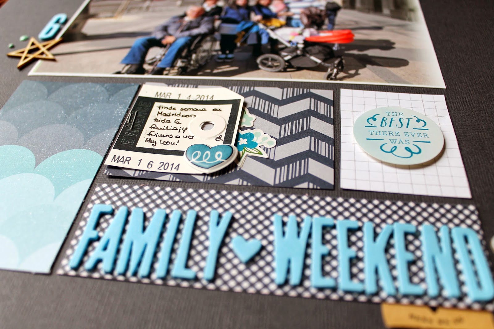
The collection of Kelly Purkey "Mon Ami" with Basicgrey is perfect to document good times on the field, at picnics, spending a day hiking or trekking... or just everyday moments. For me this kit couldn't arrive on a better moment. A few weeks ago my friends and I went to little village in the middle of nowhere to spend a couple of days together just like the old times. We chatted about nothing and everything and playing Cluedo the whole night. hehe 


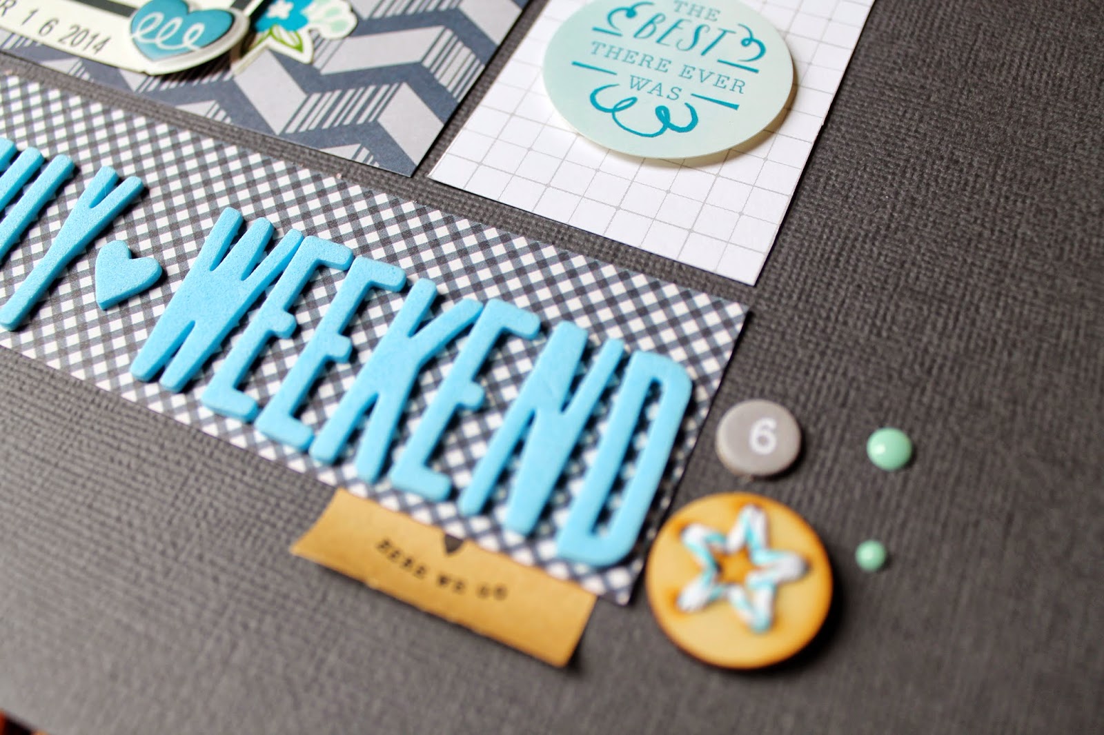
As embellishments, I could not resist cutting flowers from one of the papers from the kit and using them as ornaments. In addition to that I played with the papers and I created different designs by using stripes of different papers. Have you seen the paper chevron on top?


As I chose to use a dark paper as background, I add the little stamping on white, same as my journaling. The stamp from Technique Tuesday with all the dates was perfect for this page but as it was to big I stamped part of it several times to make an imperfect background.


Have fun playing with papers!!

xoxo

Boo


////////////////////////////////


Hola!

Y bienvenidos de nuevo a otro desafío mensual de Biscuit Project. Pero primero, vamos a echar un vistazo al boceto de este mes y al kit. Para crear este diseño he utilizado el kit de Abril Scrap Non-Stop de Biscuit Project (podéis encontrarlo aquí). Además este mes podéis completar este kit con  muchos productos nuevos en su tienda. 

Para este proyecto que decidí darle un pequeño giro al boceto, manteniendo esencialmente la misma disposición de la fotos. Decidí girarlo porque el último mes también lo torcí y resulta que al cambiarlo la pasada vez se parece mucho al sketch de este mes. Es por eso que lo giré de nuevo. Lo sé, soy un a lianta ;)

La colección de Kelly Purkey "Mon Ami" con BasicGrey es perfecta para documentar los buenos tiempos en el campo, en las comidas campestres, pasando un día de senderismo o de excursión al monte ...o simplemente momentos cotidianos. Para mí este kit no pudo llegar en un mejor momento. Hace unas semanas, mis amigas y yo fuimos a un pequeño pueblo en el medio de la nada para pasar un par de días juntas como en los viejos tiempos. Hablamos de todo y de nada y jugamos al Cluedo toda la noche. jeje

Como adornos, no pude resistirme a cortar las flores de uno de los papeles del kit y utilizarlas como adornos. Además he jugado con los papeles y he creado diferentes diseños utilizando trozos de diferentes papeles. ¿Has visto el diseño con los papeles en la parte superior?

Como he optado por utilizar un papel oscuro como fondo, he añadido el pequeño estampado en blanco, igual que mi escritura. El sello de Technique Tuesday con todas las fechas era perfecto para esta página, pero como era muy grande he estampado parte de el mismo varias veces para hacer un fondo imperfecto.

¡Diviértete jugando con los papeles!

xoxo

Boo


Apr 28, 2014

Memory Keeper

Happy Monday!

I'll be sharing this week a couple of layouts that I made inspired by the newest tutorials by Wilna Furstenberg. I have a few more proyects inspired by her laying on my craft desk right now so stay tuned if you want to checked them out.


One of the coolest thing about her latest tutorials is that she adds the cut files she created for the page so you can download them for a cheap price and use them on your own projects. On this page I used the Paint strokes cutfiles by her. They are amazingly good!! I love them!


However, I wanted to go a little bit further with the cut files and I also wanted to continue with my destashing. So, what I did is I used a few pinkish cardstocks, plus a kraft and white one to create a kind of ombre effect with the paint strokes. I chose more or less the same colors that I used to paint my Animal Topped Jars (do you remember that tutorial? ) You can find them on my photo too standing on my desk.


Then, I thought of a way to destash some of my old alphabet thickers, the ones I only had with random letters. So, I covered the paint strokes with thickers of the same color. Perfect!!
Finally, I finished my page around them with a few embellishments and my title.


xoxo

Boo

//////////////////////////////////////////////////////

¡Feliz lunes!

Esta semana compartiré un par de diseños que hice inspirandome en los nuevos tutoriales de Wilna Furstenberg. Todavía tengo algunas paginas por ahí en mi mesa a medias, así que estad atentos si quieres verlas.

Una de la cosas más guays sobre sus últimos tutoriales es que te puedes descargarte a un precio barato los archivos de recorte que crea para sus proyectos y usarlos en tus propios proyectos. Así, para esta página usé las formas de brochazo de pintura que podéis encontrar en su página web. ¡Son increíbles! ¡Me encantan!

Sin embargo, yo quería ir un poco más allá con los archivos de corte y también quería continuar con mi cruzada de deshacerme de cosas que ya no uso habitualmente. Entonces, lo que hice fue usar unas cuantas cartulinas de color rosado, además de un papel kraft y una blanca para crear una especie de efecto ómbre con los trazos de pintura. He utilizado más o menos los mismos colores que empleé para pintar las tapas de los frascos con animales (¿recordáis aquel tutorial? ) Los podeís encontrar en mi foto de esta página también de pie en mi escritorio.

Y luego pensé en una manera de usar algunos de mis viejos alfabetos, los que me quedan con letras al azar. Así, cubrí los trazos de pintura con thickers del mismo color. ¡Perfecto!
Después terminé mi página alrededor de ellos con algunos adornos y mi título.

xoxo

Boo

Apr 23, 2014

being Weird is just a side effect of being Awesome

Hello,

Since I became a subscriber of the Studio Calico Scrapbooking kits and a Design Member of Biscuit Project I have noticed that with less I achieve more. This means that now I have less products, I do not tend to buy a whole collection anymore and I just have less leftovers than before. And yet I managed to create at the same rate.


Having a kit help me to focus on the creative side, instead of on the decision of which products to use. It is more challenging as you may received products that you never thought you would use but you end up loving them. I don't know it is just my personal point of view of using kits instead of digging in the immense market out there ;)


So, this page is one of those projects where you want to kill a kit, use as much as leftovers as possible, those you thought you may not probable end up using. For example, I am not a huge lover of yellowish green so I had a lot of things of that color just laying of my table. But I have discovered that mixed with navy, it becomes a great color!! Yaaay!!


By the way, I love that quote!! Who said that being weird can't be a little bit awesome? hehe Without those little quirks, life would be such a boring thing. For sure.


What do you think? Do you enjoy using kits or you prefer to choose from the whole market?

xoxo

Boo

///////////////////////////////////

Hola,

Desde que me convertí en suscriptora de los kits de Studio Calico y me convertí en miembros del equipo de diseño de Biscuit Proyect, me he dado cuenta de que con menos puedo conseguir más. Esto significa que ahora tengo menos productos, ya no tiendo a comprar una colección entera y acabo teniendo menos sobras que antes, y aun así he conseguido crear al mismo ritmo.

Tener un kit me ayuda a concentrarme en el lado creativo, en lugar de en la decisión de qué productos usar. También puede convertirse en todo un reto, ya que puede recibir productos que nunca pensaste que usarías, pero que al final terminas amando. No sé, es sólo mi punto de vista personal sobre el uso de kits en lugar de ir a la caza en el inmenso mercado que hay ahí fuera ;)

Esta página es uno de esos proyectos en los que deseas acabar con un kit, usar tanto como es posible las cosas que te han sobrado, aquellas que pensabas que probablemente no terminarías usando. Por ejemplo, no soy gran fan del color verde amarillento, así que he tenido un montón de cosas de ese color sobre mi mesa durante largo rato. Pero retando a usar las sobras, he descubierto que encaja muy bien con azul marino, y así se convierte en un gran color. ¡Síii!

Por cierto, ¡me encanta esta frase! ¿Quién dijo que ser raro no puede ser un increíble? jeje Sin esas pequeñas peculiaridades, la vida sería super aburrida, seguro.

¿Qué pensais vosotras ? ¿Os gusta usar kits o preferís elegir entre todo lo que hay en el mercado?

xoxo

Boo

Apr 16, 2014

Teotihuacan (Step by Step)

Hello,

Today, I bring you another step by step page. It is really simple but also a good example of how to destash a big amount of wood veneers on only one page. I looooove wood veneers but sometimes I just think I have too many of the same style. In this regard, I realized I had too many cars, boats and planes. Don't get me wrong, I love adding them onto travel pages but I think I had already done that too many times and I don't want to repeat myself. So, instead of using just one or two on a page I decided to use all of the ones I had left on only one page. So, here we go:

First, I just grabbed all the products I wanted to use on this page and my photos, of course. By doing this, I focus myself on using only that and get the most out of them.


After choosing all that, I started by trimming the papers. I used a mint map patterned paper form the Daydreamer collection by Dear Lizzy as a background. Then I trimmed a white cardstock a little bit smaller and I placed on top of the other one as you can see on the photo. 

So again, the idea was to used as much wood veneers as I could. To achieve that, I started placing the wood veneers on a corner and then I continued moving across the rest of the page. I decided to add also some arrows between the transport wood veneers... as I also have too many. But do not glue them down yet. Just place them on the page, as you may still want to move them around the page, looking for a good arrangement.


In that moment,  I thought that using a wood patterned paper would be a much greater idea!! With the white cardstock it seemed too plain for me. Another good idea would have been to paint the wood veneer and the white cardstock, for example, with an ombre effect. Fabulous, right?


Once I glued the little pieces to the paper, I added my photos with a few papers behind them. And, that's it. You now have the perfect base to start adding some embellishments. I chose to add some yellow bits to make the mint pop out of the page. I also used kraft elements because they work really well with the wood paper and pieces.


Here you can see how the page looks once finished.


I hope you tried out this fun technique and if you had more ideas on how to destash wood veneers I would love to hear.

xoxo

Boo

///////////////////////////////

Hola,

Hoy os traigo un nuevo paso a paso, muy simple, pero un buen ejemplo de cómo usar un monton de chapas de madera en una sola pagina. Me encantan las chapas de madera, pero a veces creo que tengo demasiados del mismo estilo. En este caso me di cuenta de que tenía demasiados coches, barcos y aviones. Me encantan añadirlas en las páginas de viaje pero creo que ya lo he hecho muchas veces y no quiero repetirme con eso. Así que, en lugar de utilizar sólo uno o dos en una página me he decido a usar todos los que me quedaban  en una sola. Allá vamos:

En primer lugar, saqué todos los productos que quería utilizar en la página y mis fotos. Al hacer esto consigo concentrarme en unicamente estos productos y así sacarles el mayor partido posible.

Después de elegir, empecé por recortar los papeles. He utilizado un papel estampado de estilo mapa turquesa de la colección Daydreamer de Dear Lizzy como fondo. Luego recorté una cartulina blanca un poco más pequeña y la puse encima de la otra como se puede ver en la foto.

Como ya he mencionado la idea es utilizar tantas chapas de madera como pueda. Para lograr eso, empecé en una esquina a colocar las chapas de madera y luego continué moviéndome por el resto de la página. He decidido añadir también algunas flechas entre las de transporte ... porque también tengo demasiadas. Pero no las peguéis aun, simplemente colocarlas en su lugar por si aun queréis moverlas hasta encontrar un diseño bonito.

En ese momento pensé que sería una idea mas genial usar un papel con diseño de madera como fondo. Con el cartón blanco parecía demasiado soso. Otra cosa que podría haber hecho es pintar las chapas de madera y el cartón blanco, por ejemplo, con un efecto ombre. Genial, ¿verdad?

Una vez pegadas las pequeñas piezas, añadí mis fotos y un poco de papel detrás de ellas. Y, eso es todo. Ahora ya tenía la base perfecta para empezar a añadir algunos adornos. Decidí agregar algunos trozos amarillos para resaltar los tonos turquesas y los madera. También utilicé elementos kraft, ya que conjuntan muy bien con el papel de la madera y las piezas.

Así es como quedo la página una vez terminada.
Espero que os animéis a intentar esta técnica super divertida y si se os ocurren más ideas sobre cómo usar chapas de madera, me encantaría escucharlas.

xoxo

Boo

Apr 14, 2014

Spring. Currently.


planning my everyday-more-probable 3 months stay in Braunschweig (Germany)
going to Barcelona on May to meet Elizabeth Kartchner and Janna Werner and so many good scrapbooking friends! :)
becoming addicted to spending at least one afternoon per week or every two weeks at the movie theater
watching Game of Thrones season 4.... pretty exciting
reading A Beautiful Mess book to find new photography inspiration
celebrating the upcoming 1st birthday of my niece (so cute)
loving weekends so much
eating  delicious home-made french toast with yoghurt and strawberries (thanks mom)
enjoying the warm weather and the season change
wearing mint sneakers from Vans
collecting beautiful cards from my pen pals (anyone interested in exchanging hand made cards with me? ;) )
working on a new 12 hour long experiment at the lab (not cool)
walking less during the afternoons as I have to much stuff to do
trying to sleep more during the weekends, but damn! Weekends seems always so short to spend it sleeping 
feeling happy
wishing I could spend more time traveling around the world

xoxo
Boo

/////////////////////
planeando mi, cada día más probable, viaje de 3 meses a Braunschweig (Alemania)

yendo a Barcelona en mayo para conocer a Elizabeth Kartchner y Janna Werner y tnatas buenas amigas scraperas
convirtiendome adicta a pasar al menos una tarde cada semana o cada dos, en el cine
viendo Juego de tronos temporada 4....que emoción!
leyendo el libro de A Beautiful Mess con la intención de encontrar inspiración para mis fotos
celebrando o organizando el primer cumpleaños de mi sobrina (que mona)
amando los findes de semana cada día más
comiendo torrijas con fresas y yoghurt caseras (gracias ama)
disfrutando del clima cálido y del cambio de estación
vistiendo unas bambas turquesas de Vans

coleccionando cartas super bonitas de mis amigas por correspondencia ( alguien interesado en intercambiar tarjetas?)

trabajando en un experimento nuevo de 12 horas de duración en el laboratorio (no mola)
caminando menos a las tardes ya que tengo mucgo que hacer
tratando de dormir más los findes de semanas pero jo, son tan cortos los findes que da pena pasarlos durmiendo 
sintiendome feliz
deseando poder pasar más tiempo viajando por el mundo

xoxo
Boo

Apr 10, 2014

Hello there (Biscuit Project DT Challenge) and my first video!!!

Hello there,

Today, I wanted to share with you guys the page I created for Biscuit Project's section: I challenge you to... And what it is all about? If you remember from last month it means that each design team member can receive with her kit a letter (TOP SECRET) with a challenge which we have to complete no matter what it may be.  Until the reveal on the blog we even don't how many of us or who has received this month's challenge. Fun, right?

So,  I received this month's challenge and can't wait to know who else has received it :) :) 

I challenge you to... 
CREATE A PAGE IN LESS THAN 30 MINUTES

Let's see if I was able to make it....


Yaaay! Challenge completed!!! I created it with the April Biscuit Project kit in around 18 minutes. I mainly used the papers form the kit which are from the new collection Mon Ami by BasicGrey and Kelly Purkey. And this is the page. 


What about you? Wanna join this challenge?
xoxo

Boo

/////////////////////////////////

Hola a todos, 

Hoy, me paso a compartir por aquí la página que he creado para la sección de Biscuit Project llamada: Te reto a...  Bueno ¿y de qué trata todo esto? Desde el mes pasado cada miembro del equipo de diseño puede recibir con su kit una carta (TOP SECRET) con un reto que tenemos que completar sin importar lo que sea. De hecho hasta la publicación en el blog, ni siquiera nosotras sabemos cuántas de nosotras o quién ha recibido el reto de este mes. Divertido, ¿verdad? 

De nuevo recibí el reto este mes y ya no me me puedo aguantar para saber quién más lo ha recibido :) :) 


Te reto ... 
CREAR UNA PAGINA EN MENOS DE 30 MINUTOS 
(ver video)

¡Siii! !Desafío conseguido! Lo creé con el kit de abril de Biscuit Proyect en unos 18 minutos. He utilizado principalmente los papeles que forman parte del kit, que son de la nueva colección Mon Ami de BasicGrey y Kelly Purkey. Y ya esta, esta es la página. 

¿Qué os parece este reto? ¿Serías capaz de conseguirlo?


xoxo 

Boo

Apr 7, 2014

Studio Calico Office Hours Scrapbooking kit (yellow,blue and red edition)

Hello,
Today I bring you a really short post but with a lots of photos. Here you can see 3 projects that I made with the Studio Calico March Scrapbooking kit "Office Hours". This month I didn't get any add-on as at the time of the reveal I still had the February Kit untouched. So, I didn't want to have more products that the ones I could use in a month.

When I saw the kit I got inspired by its color palette. So many cool colors! So I decided to focus on one color per page. Here you can find the three main colors that I found interesting to work with from the kit.

Yellow layout: RAD
That striped paper is pure love. So beautiful!! It really matched the navy blue rub-ons included in the kit. And what about the watercolor paper die-cuts? I wanted to painted them but in the end I added them in white as I already added to much color on the page. I also used some mint embellishments for this page to contrast the dark blue.


Blue layout: Family Weekend
I am starting to love to work with dark cardstock as the background. It really makes bright colors to pop out of the page, don't you think? This photo was perfect for this page as it has a lot of blues on it. I love using huge photos on my layouts too!


Red edition: almost March
I love this one!! So bright and with such a great feeling! This is my first time using the embossing technique and I couldn't be more happier with the result. I embossed the huge flower stamp included in the kit. It is a great way to add white stamping on a colored background as normally with a common white stamp pad you can't get such an opaque and bright result.


I hope you like these pages and have fun scrapbooking!!

xoxo

Boo

//////////////////////////////////

Hola,
Hoy os traigo un breve post, pero con un montón de fotos. Podeís ver 3 proyectos que he hecho con el kit de Studio Calico de marzo de Scrapbooking " Office Hours" . Este mes no he cogido ningún add-on ya que en el momento de comprarlo todavía tenía el kit de febrero sin tocar. Por lo tanto, no quería tener más productos que los que yo podría utilizar en un mes.
Cuando vi el kit me inspiré en su paleta de colores. ¡Tantos colores tan vivos! Así que me decidí a centrarme en un color por página. Aquí podéis encontrar los tres colores principales que más me interesaron del kit.

Diseño amarillo: RAD
Ese papel de rayas es amor puro. ¡Tan bonito! Y lo bien que queda con los azules marinos de los rub-ons del kit. Y qué decir de los de papel de acuarela Troquelados. Tenía intención de pintarlos, pero al final les añadí en blanco ya que ya había añadido mucho color en la página. También usé algunos adornos de color turquesa para que contrastaran con el azul oscuro.

Diseño azul: Fin de Semana Familiar
Estoy empezando a cogerle el gusto a trabajar con cartulina oscuro como fondo. Realmente hace que los colores sobresalgan de la página, ¿no os parece? Esta foto ha resultado ser perfecta para esta página, ya que tiene un montón de azules distintos en ella. ¡Me encanta usar fotos gigantes también!

Edición Rojo: casi Marzo
¡Esta es mi favorita sin duda! Tan alegre y con una gran fuerza. Esta ha sido mi primera vez utilizando la técnica de embossing y no podría estar más feliz con el resultado. Le he dado relieve al enorme sello de la flor incluido en el kit . Sin duda es una gran manera de añadir estampado blanco sobre un fondo de color. Normalmente con un tampón de tinta blanca común no se puede conseguir un resultado tan opaco y brillante, asi que ya sabeis: para obtener algo así usad embossing.

¡Espero que os gusten estas páginas y divertíos scrapeando!

xoxo

Boo

Apr 3, 2014

Pancake Lovers

Good afternoon!!

Thank God it is almost weekend. It has been such a rough week in the lab that I am going to enjoy a good deserved rest this Sunday for sure. But until then, I would like to share my layout in honor to one of my favorite things to do on a Sunday morning: take a Brunch... mmmmmh delicious!


I started making this layout inspired by one of the latest pages by Janna Werner. Do you know her? You can check out her blog here. She makes beautiful and soft layouts with lots of paper stacking. I was in love with one of the backgrounds she made with three papers from the last collections from Dear Lizzy and Amy Tangerine. 


So, after I recreated the background, I placed my photo on top of the middle stripe of paper and I added those chunky wood veneers from Studio Calico. Aren't they super cute? After that, I added the ice cream rub-on and the lemon sticker. It is easy to find some food related items in many of the collections out there. From the latest Dear Lizzy collection I took that lemon sticker. Perfect!


It can get really tricky to take photos of both of us when we are only two traveling. So, this time we put the camera on top of the napkin box to take a photo of our awesome and full of calories brunch. Yummy!


And yeah, as a birthday present my family bought me a Silhouette Portrait machine with which I created the white "Pancake Lovers" title. I already know I am gonna use this machine all the time!

xoxo

Boo

P.S. Next May I will attend to the 6th Anniversary of Kits de Somni which consists of a weekend full of workshops (find more info here). And... Elizabeth Kartchner and Janna Werner will be the awesome teachers of these workshops!!!  Yaaaaaay!!!!! I am pretty excited about this weekend, can't wait for it to arrive. It will be also the first workshop I attend and having these awesome host/teachers will make it even more awesome!! ;)

////////////////////////////////

¡Buenas tardes!

Gracias a Dios que ya es casi fin de semana... Ha sido una semana tan difícil en el laboratorio que voy a disfrutar seguro seguro de un buen merecido descanso este domingo. Pero que hasta que llegue el domingo, me gustaría compartir una página en honor a una de mis cosas favoritas y que suelo hacer el domingo por la mañana : tomar un brunch ... mmmmmh ¡delicioso!

Comencé este diseño inspirado en una de las últimas páginas de Janna Werner. ¿La conoces? Si no, puedes conocer su blog aquí. Ella hace hermosos diseños, muy suaves y normalmente suele poner un montón de papeles apilados para dar textura a sus páginas. Me enamoré del fondo que hizo con tres papeles de las últimas colecciones de Dear Lizzy y Amy Tangerine para uno de sus proyectos.

Así que, después de recrear el fondo, puse mi foto en la parte superior de la tira del medio y comencé a añadir las formas de madera de Studio Calico. ¿No son super monas? A continuación añadí el rubb-on de helado y el pequeño limón. Suele ser habitual encontrar elementos relacionados con comida en muchas de las colecciones que hay por ahí.  ¡Perfecto !

Puede llegar a ser un poco difícil tomar fotos de ambos en los viajes cuando solo estamos los dos. Así que, esta vez pusimos la cámara en la parte superior del servilletero para poder sacar una foto de nuestro impresionante y super calórico brunch. ¡Ñaaaam!

Y sí, como regalo de cumpleaños, mi familia me compró una máquina Silhoette Portrait con la que realice el titulo blanco (Pancake lovers). Estoy segura de que me pasaré todo el dia usandola jeje

xoxo

Boo

P.D. Este próximo mes de mayo voy a asistir al sexto aniversario de Kits de Somni que consiste en un fin de semana lleno de talleres (podeís encontrar más información aquí). Y ... ¡Elizabeth Kartchner y Janna Werner serán las impresionantes profesoras de estos talleres! ¡¡¡Siiiiiiiii!!! Estoy muy emocionada con este fin de semana, no puedo esperar a que llegue . Será también el primer taller al que asisto y tener estas anfitriones/ profesoras increíbles hará que sea aún más perfecto ;)